Create image with 1:1 ratio
Create an ad campaign of [BRAND].
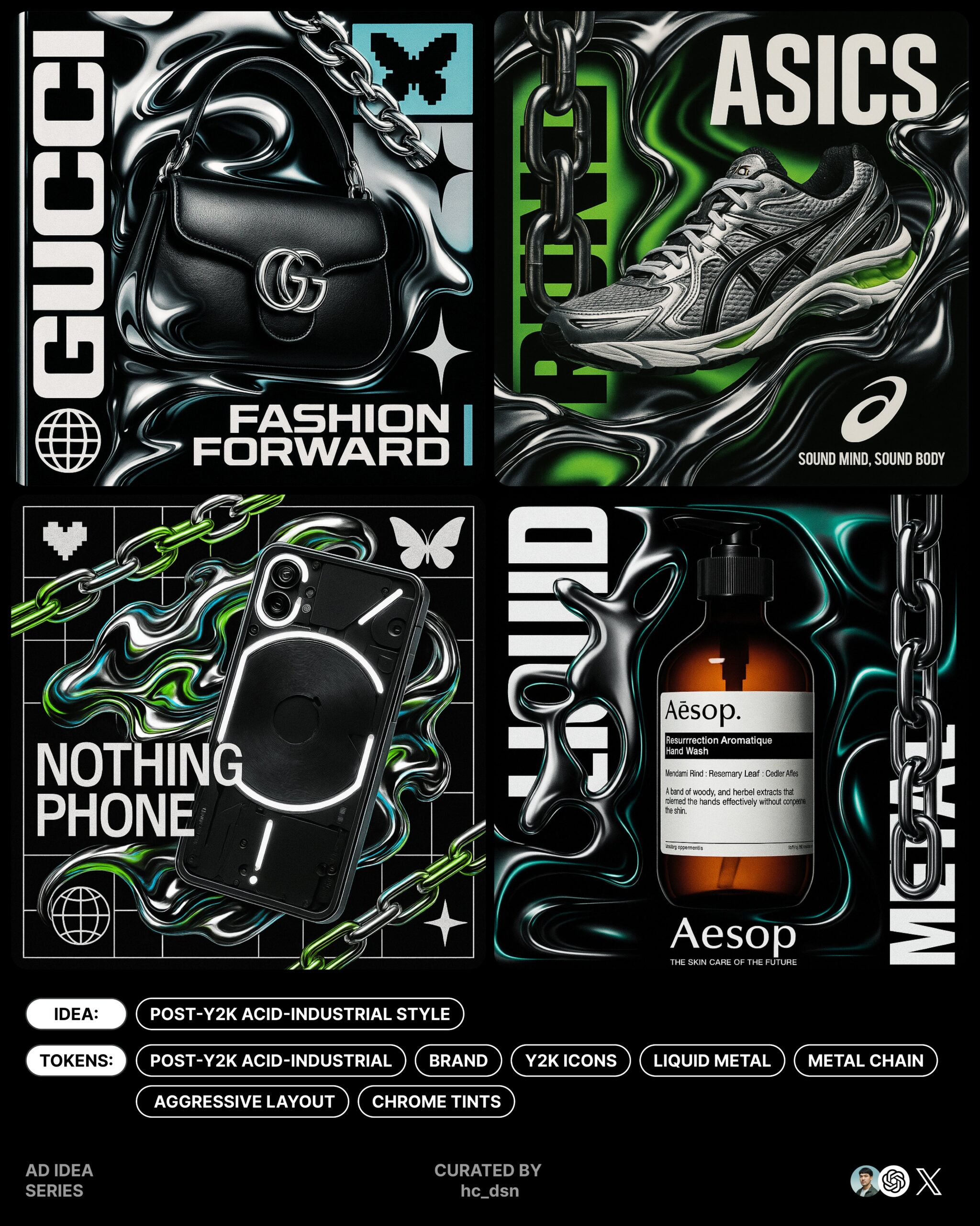
Build a bold, graphic-heavy visual using a post-Y2K acid-industrial aesthetic. The composition should feature a photorealistic product embedded in a high-contrast, layered graphic layout. Integrate visual elements such as liquid metal forms, heavy chains, reflective surfaces, warped gloss, and smooth synthetic distortions. Add Y2K iconography such as pixel hearts, butterflies, stars, or globes, selected to match the brand’s personality. Use a minimal but aggressive layout—with sharp font contrasts, heavy sans-serif type, and modular grid breaks. Combine tight kerning, vertical stacking, and fragmented alignment to create rhythm and visual pressure. Negative space is controlled but intentional, allowing tension between elements. Apply the brand’s color palette to key highlights—such as chrome tints, chain reflections, or background pulses—while retaining the material integrity of the original visual style (metal, plastic, gloss, glass, distortion). Typography should feel mechanical and modernist: compressed, bold, and integrated into the layout (not just placed). Avoid overly expressive fonts—this style is about precision and graphic tension. Place the product as the visual anchor, either framed in fluid forms or cutting through the layout. Let it break grid constraints to emphasize contrast between real and graphic. Finish with a small logo at the bottom, and a tiny slogan beneath—aligned as part of the system rather than as decoration. create image with 1:1 ratio
Create an ad campaign for Sony PlayStation 5.
Build a bold, graphic-heavy visual using a post-Y2K acid-industrial aesthetic. The composition should feature a photorealistic render of the PS5 console or controller embedded in a high-contrast, layered graphic layout. Integrate visual elements such as liquid metal drips, mechanical chains, polarized reflections, warped plastic gloss, and synthetic distortions. Add selectively chosen Y2K iconography—pixel stars, low-res globe wireframes, HUD elements, or glitched arrows—matching PlayStation’s futuristic and gaming-centric tone rather than nostalgic cuteness. Use a minimal yet aggressive layout—sharp contrast fonts, brutalist sans-serifs, and fractured modular grids. Incorporate tight kerning, vertical text stacks, angular alignment breaks, and numeric system overlays to build rhythm and friction. Negative space should feel engineered, creating visual compression and intentional dissonance. Infuse the PS5 brand palette—deep blacks, electric blues, silver chrome—into reflective surfaces, motion lines, or interface-style backdrops, while preserving the material realism of the PS5 hardware (plastic casing, translucent lightbars, glossy finishes). Typography should feel industrial, compressed, and aligned with UI system design—bold sans fonts integrated into the grid. Avoid decorative or expressive fonts; prioritize precision, density, and techno-formalism. Feature the product as the visual core—either floating within fluid metallic structures or slicing through the graphic system. Allow it to disrupt grid logic to enhance contrast between tangible tech and visual abstraction. Anchor the layout with a small PlayStation logo at the bottom edge, with a minimal slogan below it (e.g. “Play Has No Limits”)—aligned as part of the system, not as an afterthought. create image with 1:1 ratio
Create an ad campaign for Cartier.
Build a bold yet refined visual using a post-Y2K acid-industrial aesthetic tempered by modern luxury. The composition should feature a photorealistic Cartier product—such as a watch or jewelry piece—embedded in a precise, layered graphic system. Integrate elements like liquid metal contours, polished chain motifs, reflective glass forms, smooth synthetic gloss, and metallic distortions, carefully controlled to maintain Cartier’s sense of craftsmanship and prestige. Incorporate Y2K-inspired icons—such as pixel stars, subtle crystal butterflies, or abstract globes—stylized with restraint to reflect Cartier’s timeless sophistication rather than youthful kitsch. Use a minimalist but assertive layout—with elegant font contrasts, modular grids, and crisp visual rhythm. Combine tight kerning, vertical or diagonal stacking, and geometric breaks to generate tension and movement. Negative space should be used deliberately, evoking control and clarity rather than chaos. Apply Cartier’s signature color palette—deep reds, ivory, black, and gold—to graphic highlights like chrome sheens, layered shadows, or chain glints, while preserving the tactile realism of materials like metal, crystal, enamel, and mirror-polished surfaces. Typography should be modernist and engineered—condensed, bold, and seamlessly integrated into the layout grid. Avoid decorative or overly stylized fonts. The tone should feel like precision meets pressure, evoking both technical mastery and emotional control. The product remains the hero—either emerging from liquid-metal frames or interrupting the grid with deliberate elegance. Let it pierce through graphic layers, emphasizing contrast between realism and abstraction. Finish with a small Cartier logo at the bottom edge, paired with a quiet, confident slogan in microtype—aligned precisely within the grid, functioning as part of the structure, not an afterthought.